Pet Peeve — wrong use of curly apostrophes
I do love curly quotes and apostrophes. But it annoys me to see them used incorrectly. I’m in my mid-50s, so I’ve been around computers and typewriters for a long time. In fact, I first learned to type banging on an old manual in 10th grade.
If you look at your keyboard you’ll see that there’s only one key, just to the left of your return key, for an apostrophe or a double quotation mark. And that’s because the early typewriter fonts used straight marks, not curly ones, as shown in the illustration to the right. The curly marks were the domain of professional typesetters at printing companies.
Then came the computer and soon everyone had the power to use the curly marks all the time– the computer takes care of the curl, placing the correct quotation marks at the front and back of the phrase, or inserting the correct apostrophe symbol. The computer handles this by making the leading mark (the left-double or left-single) swoop down to the right, and the following mark (the right-double or right-single) ease down to the left. Trouble is, the computer can’t think for you and typography can’t always be reduced to computer-recognizable rules.
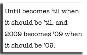
It’s August, and there are a lot of ads for cars or furniture that use the contractions of “until” or “2009.” And the designers get it wrong. They let the computer decide what the apostrophe is supposed to look like. Maybe they’re in a hurry, or maybe they never learned the correct use of the apostrophe, or maybe they just think that everyone else is doing it, so it must be okay. The best way I know to remember the correct placement of the curly apostrophe is that it’s supposed to be “looking at” the part that’s missing. The “un” is missing in ’til, and the “2o” is missing in ’09.
FIX THIS– there’s usually a simple way to fix it. You can type until and go back and take off the “un.” This is a work-around that fools the computer into giving you the correct mark. If you’re a professional, using software such as InDesign, you are better off inserting the proper code because that will be sure to keep the correct mark no matter which printer or computer is used. [To do this in InDesign, do: TYPE > INSERT SPECIAL CHARACTER > QUOTATION MARKS > SINGLE RIGHT QUOTATION MARK.]
This can be harder when numbers are involved, depending on the font and the software used. I had a lot of trouble doing the ’09 above, and ended up doing it with InDesign, then copy/pasted it into WordPress. If you know HTML well enough, you can insert the code yourself. If nothing seems to work for you, then just spell out “until” and “2009” and you won’t go wrong.


Thanks! I stumbled upon this page while searching for a reference on the correct usage of curly apostrophes.
LikeLike
Glad you found this and I was able to help! I’ve got some other tips in the works– was lucky enough to have some old-time printers as mentors at an old job. Humm, that’d be a good post too.
LikeLike
Great post,
Currently working on a catalog that displays inch & foot marks as well as quotes and apostrophes – wanted to make sure I was generating the correct typography.
LikeLike
Thanks for posting this rule. I’m working on a set of books with all straight quotes and apostrophes, and we’re not talking about measurements. Does the apostrophe rule also apply to contractions like “we’d” and “you’ve”? It seems to me that the apostrophes there are looking the other way.
LikeLike
Looking at the missing part; nice and simple. Thank you.
LikeLike
Thanks so much for this fantastic post. Completely answered my question. Tried looking in the Chicago Manual of Style to find out which way that apostrophe should curl to no avail. You are my saviour.
LikeLike
Here’s an apostrophe usage question for you: I want to shorten the expression “wash and wear”.
Is it, wash ’n wear, wash n’ wear, or wash ’n’ wear?
LikeLike
Michael, Andi, Mikkel and Morgan: Thanks for your comments. I’ve been offline for a long time, and tonight decided to go through over 2,000 emails and begin to catch up. Appreciate your comments. Let’s see if I can answer questions.
Andi, we’d and you’ve would also have quotation marks facing left. They are contractions for “we would” and “you have” so will still be facing the part that’s missing.
I believe the same rule answers your question, Morgan. I’d put in two left facing curly single quote marks. The first one to replace the ‘a’ and the second one to replace the ‘d’.
LikeLike
Yes! A pet peeve of mine as well, that I try to let go… unless I’m writing or editing 😉
LikeLike